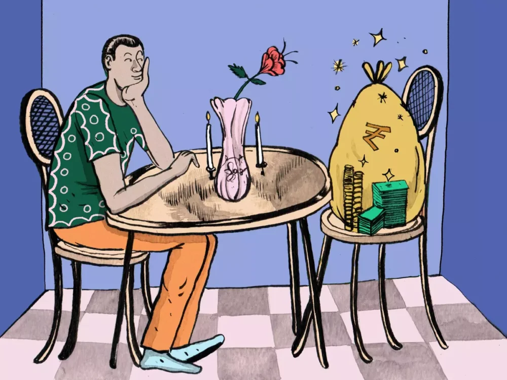
It’s OK to Want More Money
The way we think about money, and what we do with it, tends to be shaped heavily by t...

It’s one of those days when you know that nothing but an iced coffee can make your soul sing. You order one off Swiggy, and as your order is confirmed, there’s a big check mark! The task was simple enough, but suddenly, it feels like an accomplishment — and your anticipation builds. You peer closely at your screen, watching the icon of a little Swiggy scooter follow a labyrinthine route to you, before another ding! announces that your delivery has arrived.
Over the last several years, as shopping online has witnessed a meteoric rise in consumer engagement, retail therapy has evolved to be an immensely joyful experience, by design. Buying goods online is now a sensory experience. We spend much of our days tapping, scrolling and swiping on our phone screens, hearing dings and beeps, deeply entwined with a digital world. And the platforms we use are often designed to leave us with positive experiences — often by stimulating our visual and auditory senses. While brick-and-mortar stores have been able to entice passers-by and potential customers not only with objects to touch, but also scents and sounds, the online world has traditionally had to rely on visual and auditory cues to capture our attention. This level of detail, from a UI/UX design perspective, may seem slight — and in many ways, not even register in our consciousness — but is still impactful.
“Experiences [online, traditionally] are made up of three components: visuals, haptic, and sound,” explains Connor Moore, the founder of CMoore Sound, a San Francisco–based sound design agency that has worked with clients like Google, Uber and Tesla. He talks about how sonic cues are crucial — even when unaccompanied by visuals or haptics — on an episode about sound design on Adobe’s Wireframe podcast. Sonic cues can direct users to action, have come to form an integral part of branding, and have the ability to make overall user experience more pleasant.
Like the check mark on Swiggy, processing payments on Google Pay — to, say, a small business you just shopped from — activates a pop of confetti, with a pleasing sonic cue. Apps like Google Pay also make rewards and cashbacks more exciting, incorporating design elements like scratch cards into the user experience. These scratch cards — and the expectation from users to scrape away colour to reveal the reward — are an example of skeuomorphism, a term for when virtual design elements mimic physical objects (often to encourage easy, intuitive interaction). Another good example of a skeuomorphic sonic cue is the satisfying ka-ching sound of a cash register closing, which business owners using Shopify hear when a new order comes through.
The one thing that most online retailers, from ticketing portals and travel booking sites to on-demand apps like Uber and Swiggy, have in common is wait times. Turns out, “design can completely change whether a five-minute wait feels reasonable or completely unbearable,” as explained on an episode of the podcast 99% Invisible. Visual cues have seen much innovation since the days of yore when early computers used a static pixellated hourglass to symbolise processes underway. Today, being able to clearly grasp exactly what is going on — how far away your Uber driver is, how long the web page will take to load — is a way for these platforms to retain our attention and foster an environment of patience in times of instant gratification.
As we go about our days, buying groceries, paying for clothes, and ordering dinner online, we’ll continue to encounter dings and pops, rewards and notifications along the way. And as our digital realms expand to include more interactions with Extended Reality (XR), in the Metaverse and elsewhere, it will be interesting to note — as IBM confirms — the ways in which sensory stimuli seep into customer experiences and impact the way we spend our money.

The views in the article /blog are personal and that of the author. The idea is to create awareness and not intended to provide any product recommendations.