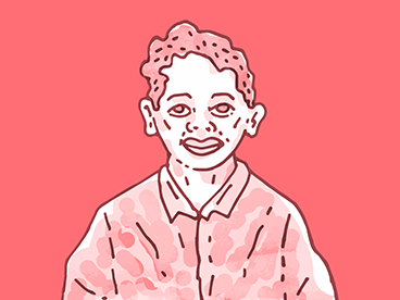
Kalapi Gajjar-Bordawekar has been working with fonts for about a decade. He is a typeface designer and font engineer, and helms the type foundry Universal Thirst, with his co-founder Gunnar Vilhjálmsson. Split across Bangalore and Reykjavik (in Iceland), the foundry has been working to make digital typefaces more accessible across various Indian script systems. They have designed typefaces for global brands like Google, Monotype, Frieze Art Fair, and others. For One on One — our exclusive series of leisurely interviews with people building fascinating careers that are far from traditional 9-to-5 jobs — we speak to him about his work, why becoming an entrepreneur was a financial wake-up call, and how type informs communication.
This conversation took place in November 2022. It has been edited for clarity and length.
For the uninitiated, could you briefly explain what the role of a font engineer is?
Modern fonts are complex pieces of software. And like any other software, they require planning, execution, and thorough testing to ensure reliable function. There are several aspects to font engineering, including preparing OpenType layout code that controls how letterforms combine and transform to output the correct or intended form (ligatures and conjunct consonants in Indic scripts are common examples of such transformations). In addition to this, an engineer ensures that the font works across a multitude of operating systems and applications on various platforms by adding all the relevant metadata. The role is very similar to that of a programmer, with added requirements in linguistics and aesthetics.
What is your earliest memory of being interested in type?
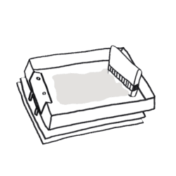
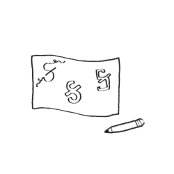
My father is a photographer and graphic designer, and when I was younger, he used to run a serigraphy (or screen printing) studio as an extension to his design practice. Since a lot of the development work at the time was manual, one of the most common tools for typography were the Letraset dry-transfer sheets, which contained all the letters of different typefaces in various sizes and colours. After his practice shifted to the digital medium, these Letraset sheets became redundant. I was happy to claim them as part of my art supplies, and used them to letter my name on my school workbooks.
Do you remember when you first realised the importance of managing your own finances or when you first took the initiative to invest? Where did you start?
I realised the importance of investing and managing my finances when I was almost in my late 20s. I grew up in a middle-class family, with art and humanities at the centre of our lives, and I never expected or desired to be wealthy. After establishing our studio practice in 2016, it quickly became evident to me that I needed to figure out how to manage revenue. With the help of a financial advisor and Chartered Accountant, I was able to structure my finances in a way to support my life and practice.
When it comes to designing a new typeface, where do you begin? Is there a particular letter or icon you look forward to creating?
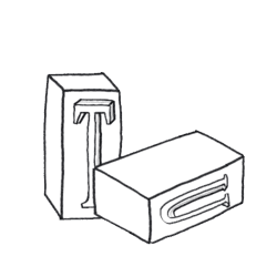
The first step is to define a brief. Since typefaces are tools, different ones are designed to solve specific problems or complement a particular visual language. A conceptualising phase attempts to arrive at possible solutions to the brief by drawing a limited set of glyphs, which form the essence of all the shapes. When I was studying to become a typeface designer, I was taught, in the case of the Latin alphabet, to use the sequence ‘a-d-h-e-s-i-o-n’ as it contains a lot of the common strokes and parts of all of the Latin letterforms.
I have a different letter that I look forward to drawing for every script, but my absolute favourite is the ‘Ka’ from the Gujarati script (I’m biased!).
While we’re now familiar with working remotely post-pandemic, what was it like for you and your Icelandic co-founder when you started Universal Thirst? How did you navigate time differences?
My relationship with ‘corporate time’ (the 9-to-5) has been and continues to be tumultuous. I’ve made peace with the fact that keeping fluid work hours is how I work most efficiently. I work more cumulative hours overall through the week, and typeface design is always on my mind. This helped early on because Gunnar would be available from mid-day (IST) until much later into the night, and we were able to effectively collaborate to set up systems and processes that are now entirely automated and require less face time. The slow pace of typeface design is conducive to this style of work.
A considerable number of South Asian scripts are only recently beginning to gain recognition, especially when it comes to type for digital platforms. Do you see a future when people have equal access to high-quality fonts for whatever script they prefer to use in their communications?
Definitely. There is a lot of work being done by many talented designers to respond to the need for fonts in different scripts for both functional and expressive purposes. And with the standardisation of software in terms of Unicode and other internationalisation technologies, there is a lot more ease with which users can take advantage and have easier access to different typefaces for Indic scripts. With respect to the increased availability of typefaces, we can already see a change in how designers and studios are incorporating them into their projects, and this further pushes the creation of newer fonts that can meet the increasing demand. Our goal with the Universal Thirst library — our collection of retail typefaces — is to provide a wide range of expressions for the different script systems in India.
As a layperson, how does one go about cultivating an appreciation for typefaces or taking note of them in our surroundings?
The only good thing to come out of the delayed support for the vernacular in digital technologies is the flourishing of more analog forms of visual communication that define our visual landscape. At the very least, all you have to do is look closely at your immediate environment. Urban spaces incorporate a rich culture of letterforms on every available surface. If you want to dig deeper, you can sign up for one of the many type walks offered by designers in many of the major cities. There are also many books and online resources, like our Universal Thirst Gazette, that aim to share the history and practice of typography.
Why should a brand bother commissioning a font for itself?
If a project has a generous budget, brands and designers should try to incorporate and commission a custom typeface. This approach can have many advantages. Here’s one example: before Universal Thirst, I used to work for a foundry in the UK. We designed a custom typeface for a telecommunications company, which was ultimately purchased by a larger tech conglomerate. During the acquisition, the custom fonts became an important part of the negotiations since they were considered an invaluable part of the intellectual property as the technology heavily relied on them for the efficient functioning of the platform.
Did the decision to follow your passion impact your personal finances? If yes, how?
When I decided to study typeface design, it was seen as a fool’s errand. There was no market or work for typeface designers in India (and one can argue that there still isn’t one). I decided to do it anyway — if nothing was to come of it, I would return to working as a communication designer with a stronger understanding of typography. As luck would have it, with India becoming an emerging user base for technology, offering localised digital products has become a high priority, and as a result, we are able to take on large-scale projects that help us support not only our passion but also a team that is equally interested in our shared goals.
How did you go about aligning your interest in type design with your financial goals?
I don’t think I’ve ever thought of my practice as being aligned with a guaranteed return on investment. In 2016, I left a well-paying job in London to co-found Universal Thirst with the sole intention of researching the emerging context of vernacular typography in the digital domain. I must admit, however, that because we now have a larger team that depends on us, we feel a higher sense of responsibility to make our practice more sustainable and actively lobby for work by making strategic presentations.
How much can someone working in this space expect to earn?
Being a full-service typeface producer requires a lot of specific skills. These skills are not necessarily taught. In my case, I studied typeface design in a Master’s degree programme but only learnt the nuances of font engineering under highly experienced mentors at my first job.
There are three major pathways to a career in typeface design — working independently, in a design studio, or in a tech company. An independent typeface designer can expect to earn anywhere between ₹5–50 lakh a year, depending on skill level and experience. However, there are many conditions and caveats to this range. Design salaries for staff designers in a foundry or type design studio vary greatly from one country to the next, and information is difficult to come by — as a rule of thumb, a typeface designer is paid more on average than a graphic designer. In India, this can range anywhere between ₹9–18 lakh per annum. The role of a staff designer in a tech company as part of an in-house fonts team is very rare and available mainly in North America. In this case, the salaries are on the same level as those of other workers in tech.
Tell us a little bit about what you’re looking forward to and / or working on next.
We just completed two large-scale projects with high visibility and impact, which we’re very excited to see being used in the wild. Other than these two projects, I’m personally excited about working on more self-directed projects to build our own typeface library.
Kalapi Gajjar-Bordawekar’s MoneySign™ is Persistent Horse. Discover yours here.
